Accessibility at government scale: PLCB
Modernizing a state agency's B2B and B2C commerce sites, and treating accessibility as design work rather than a compliance checkbox.
- Client
- Pennsylvania Liquor Control Board (via Oracle)
- Role
- UX Designer & Accessibility Specialist
- Team
- 3 designers, 2 engineers, 1 QA
- Timeline
- ~1 year · 2022-2023
- Status
- Shipped
Summary
- The problem
- The PLCB needed to modernize its B2B and B2C desktop and mobile commerce sites for clarity and current design standards, and as a state agency to meet real accessibility obligations rather than nominal ones.
- Why it mattered
- A state retailer serves everyone by definition. Someone using a screen reader or keyboard here is not an edge case, they are a customer with nowhere else to buy.
- My contribution
- I ran the accessibility audit across both sites, logged and triaged 200+ issues in JIRA with engineering and QA, and designed the interface changes that resolved them, including the discount-display pattern below.
- The result
- 200+ accessibility issues identified and resolved; the redesigned sites shipped.
How this project ran
- 01Audit both sitesAutomated checks plus screen-reader passes through real task flows, on both the B2B and B2C sites.
- 02Write tickets engineers could act onEach issue logged with the failure, the standard it violates, and what fixed looks like.
- 03Design the fixesRework the interface patterns behind the failures rather than patching symptoms.
- 04Triage and verifyWork the queue with engineering and QA until issues were shipped and confirmed.
- 05ShipRedesigned B2B and B2C sites launched with 200+ issues resolved.
01 Problem and context
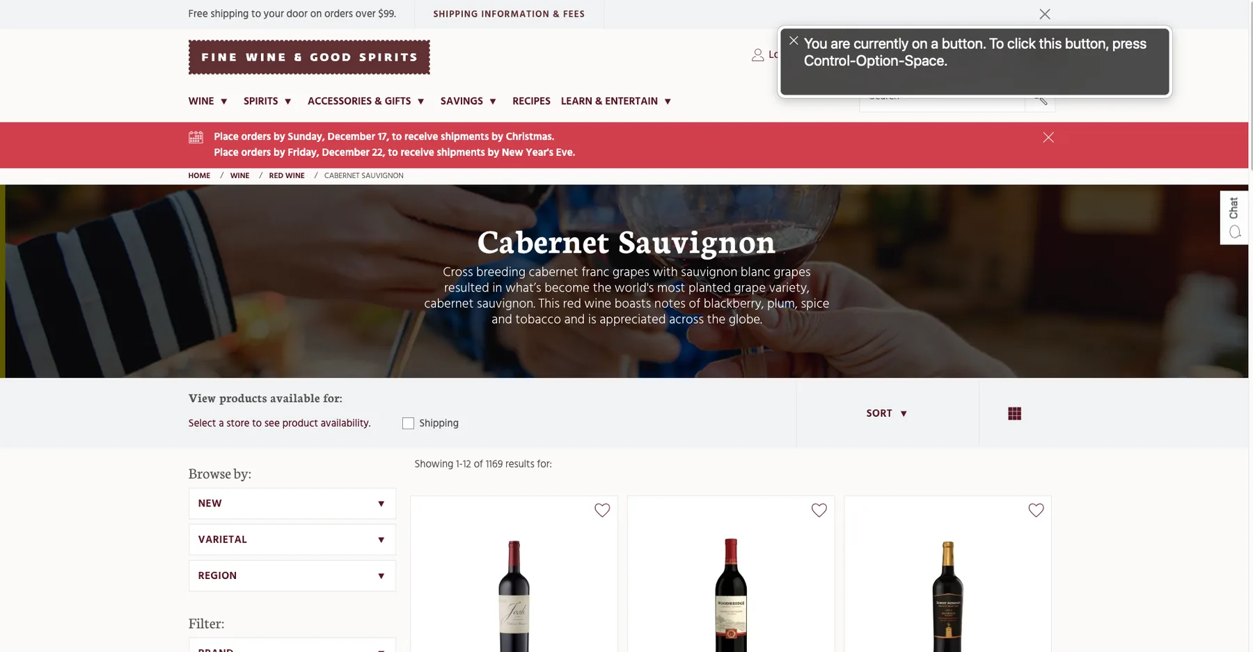
The PLCB had bought Oracle's commerce platform and came to our consulting team to build on it: the public Fine Wine & Good Spirits storefront plus its B2B counterpart, across desktop and mobile. Their mandate was modernization. Align with current design conventions, improve content discoverability, and raise overall clarity.
Accessibility was the part that couldn't be treated as polish. A state agency's site carries compliance obligations, and compliance failures on a commerce flow mean someone literally cannot complete a purchase.
02 Role and scope
- I owned: the accessibility audit and its remediation design: testing, issue identification, ticket authoring, and the design fixes.
- Shared: the broader redesign with two other designers; ticket triage and verification with two engineers and QA.
- Others owned: implementation and release. A finding only counted once engineering shipped it and QA confirmed it.
03 Constraints
- No user research budget. Timeline didn't allow for user interviews or usability sessions. Instead of pretending otherwise, I leaned on published e-commerce UX research (Baymard Institute) as the evidence base for interface decisions, and I'm explicit that this is secondary research, not findings from PLCB's own users.
- Platform capability. Designs had to be buildable within the commerce platform's constraints, which shaped what remediation was possible.
04 How I audited
The failures that matter most are the ones automation can't see.
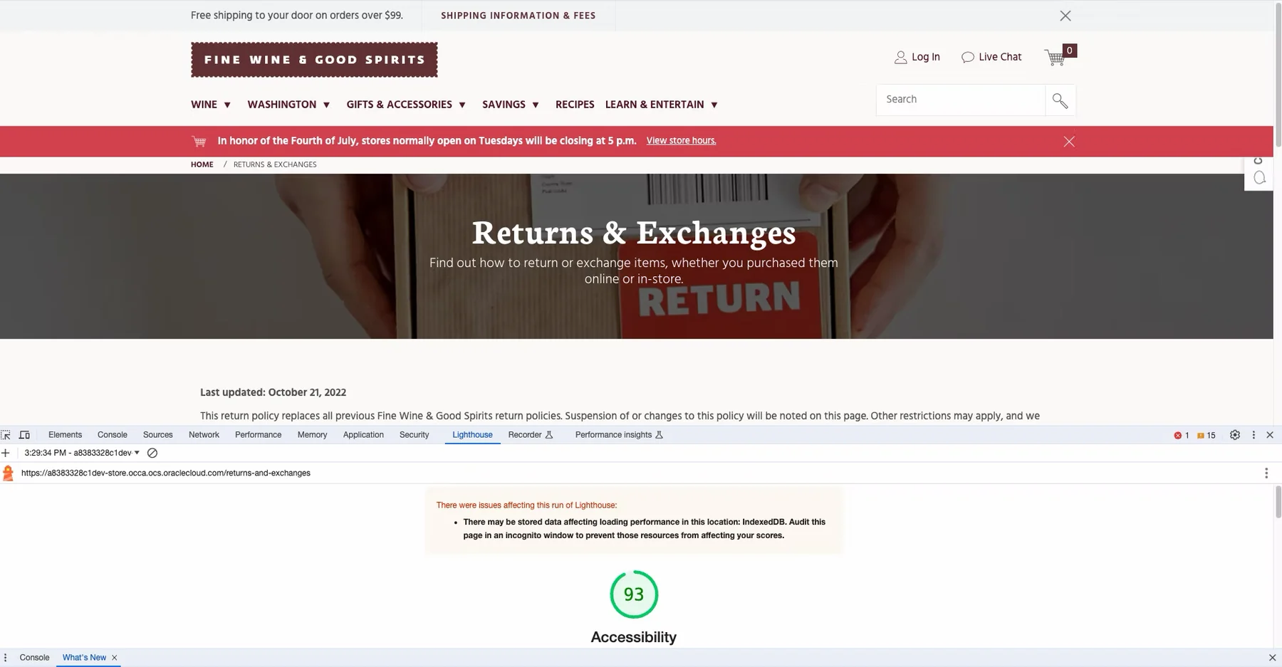
I combined automated and manual testing: Lighthouse for programmatic checks, the Oracle Accessibility Toolbar for structural inspection, and screen-reader passes through real task flows. An automated tool will confirm a button has an accessible name; only walking the flow tells you whether the announcement makes sense in sequence.
05 Key decision: a discount pattern that stayed accessible
Not every finding was a violation. Auditing the product tiles surfaced a readability problem the automated tools had nothing to say about, and fixing it meant designing a new pattern rather than correcting a broken one. The constraint was that whatever replaced it still had to hold up for someone using a keyboard or a screen reader.
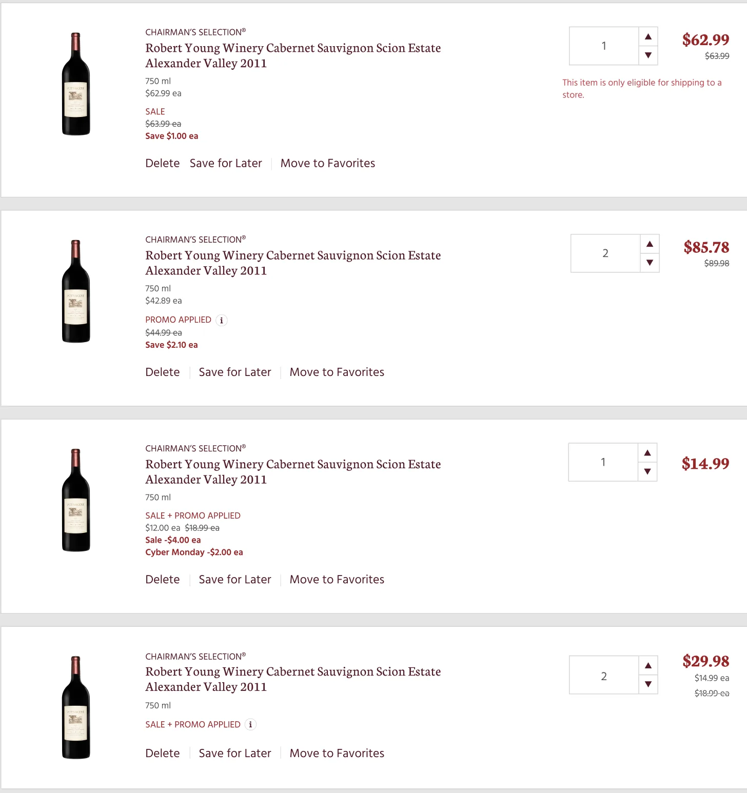
Products could carry several overlapping price reductions at once: a base sale, a promotion, a seasonal offer, each meaningful to shoppers deciding what to buy. Showing every component inline made cart rows dense and hard to scan; showing only the final price hid information people needed to trust the total.
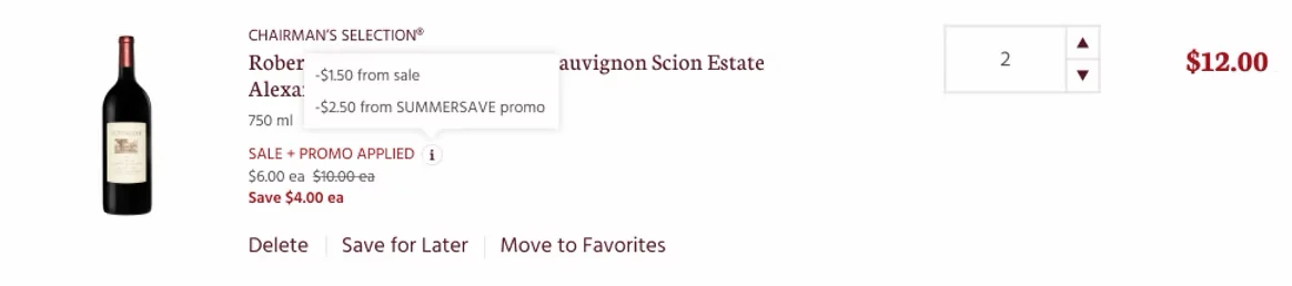
The decision: lead with the resulting price and savings, and move the breakdown into an information tooltip attached to the promo label. This keeps the scannable hierarchy intact while leaving the detail available on demand.
The trade-off I accepted: tooltips are a compromise. They add an interaction step, and hover-only patterns are an accessibility trap. That's precisely why the detail sits on a focusable, labeled control instead of a hover-only one, and why the visible summary is enough to decide on its own. Nothing essential lives only in the tooltip.
06 Outcome
- 200+ accessibility issues identified, documented, and resolved with engineering and QA.
- The redesigned B2B and B2C sites shipped.
07 How I would measure this
I had delivery evidence: issues found, tickets closed, sites launched. I did not have post-launch usability or conversion data. What I would ask for now:
- A repeat automated audit 90 days post-launch, to see whether the fixes held as new content shipped.
- Task completion for checkout using only a keyboard, since that is the flow where failure means someone cannot buy at all.
08 Reflection
- What I took from it: I learned the WCAG requirements properly, and the tools to check whether my work meets them. That is now part of how I design rather than something I check at the end.
- What I could not solve: without a research budget I could not test with the people the fixes were for. Published research and standards were the best evidence available, and I would rather say that plainly than imply findings I did not have.