From style guide to LLM-ready design system
Turning loose guidelines into a tokenized system with written rules, then building the harness that lets an LLM generate accurate Frequency Studio wireframes.
- Product
- Frequency Studio · B2B streaming TV SaaS
- Role
- Systems UX Designer · initiated and built solo
- Timeline
- Nov 2025 to present
- Status
- Harness in use by the design team; engineering phase awaiting resourcing
- Scale
- 104 component rule docs · 485 token variables · 3-tier architecture
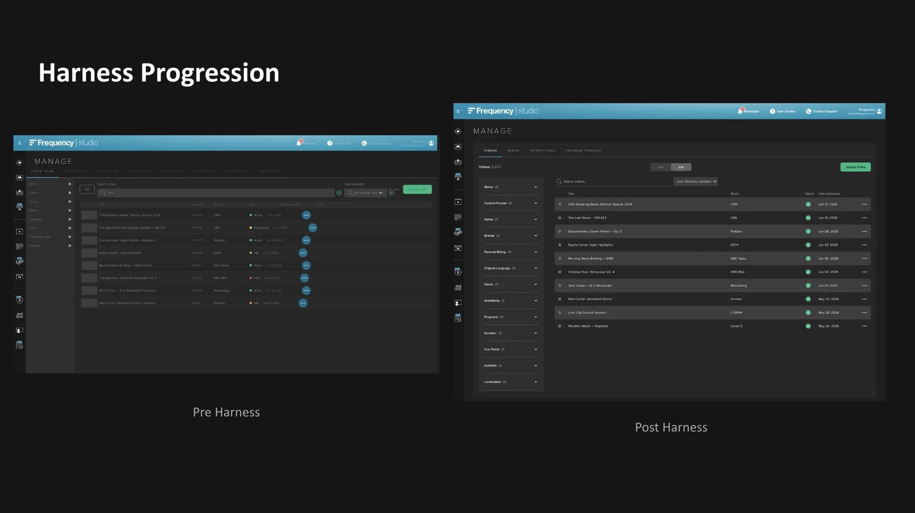
Summary
- The problem
- Frequency had a style guide of suggestions, not rules. Colors, fonts, and spacing drifted across the product, engineers kept asking why similar tables were styled differently, and nothing was consistent enough for an LLM to build from.
- Why it mattered
- Every inconsistency cost time in design-engineering back-and-forth. And once LLMs could produce accurate mockups, the difference between a style guide and a system a machine can follow became the difference between exploring one idea a day and exploring four.
- My contribution
- I initiated and built the whole design side solo: a 3-tier token system (485 variables), rebuilt components, 104 written rule docs, three audits, and the LLM harness itself, plus the roadmap and pitch that define the engineering path to Code Connect.
- The result
- The harness generates Frequency Studio wireframes accurate enough that the design team uses it in daily work. A first-pass high-fidelity wireframe that used to take a day now takes an hour or two. Exploring a new idea or direction is quick enough that we get through far more ideation than we used to, and options that would once have been too expensive to try now get tried.
How this project ran
- 01Audit what existedInventory every color, type style, spacing value and component variant already in use.
- 02TokenizeResearch two-tier versus three-tier architectures, then establish the structure that fits how our product actually grows.
- 03Rebuild componentsRebuild the library on those tokens.
- 04Write the rulesDocument what each component is for and when to use it, one doc per component.
- 05Build the harnessPackage tokens, rules and patterns as skills an LLM can generate from.
- 06Connect to codein progressAudit the codebase and pitch the roadmap that gets tokens into production.
01 Problem and context
What existed in late 2025: a style guide, a set of components, and wireframe templates. There were general guidelines for color, type, sizing and spacing, so this was not a blank slate. The problem was variance. Each guideline had accumulated so many variants that "follow the style guide" no longer produced a predictable result, and there was no tokenization, no rules for which variant belonged where, and inconsistent use of auto layout.
The problem was not absence. It was variance.
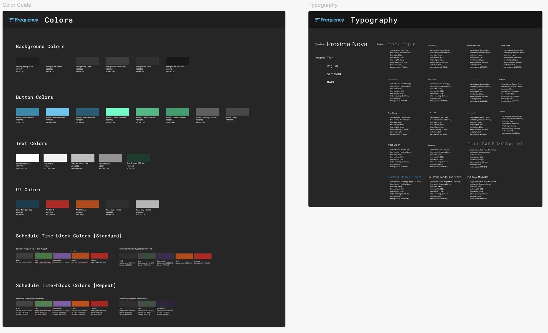
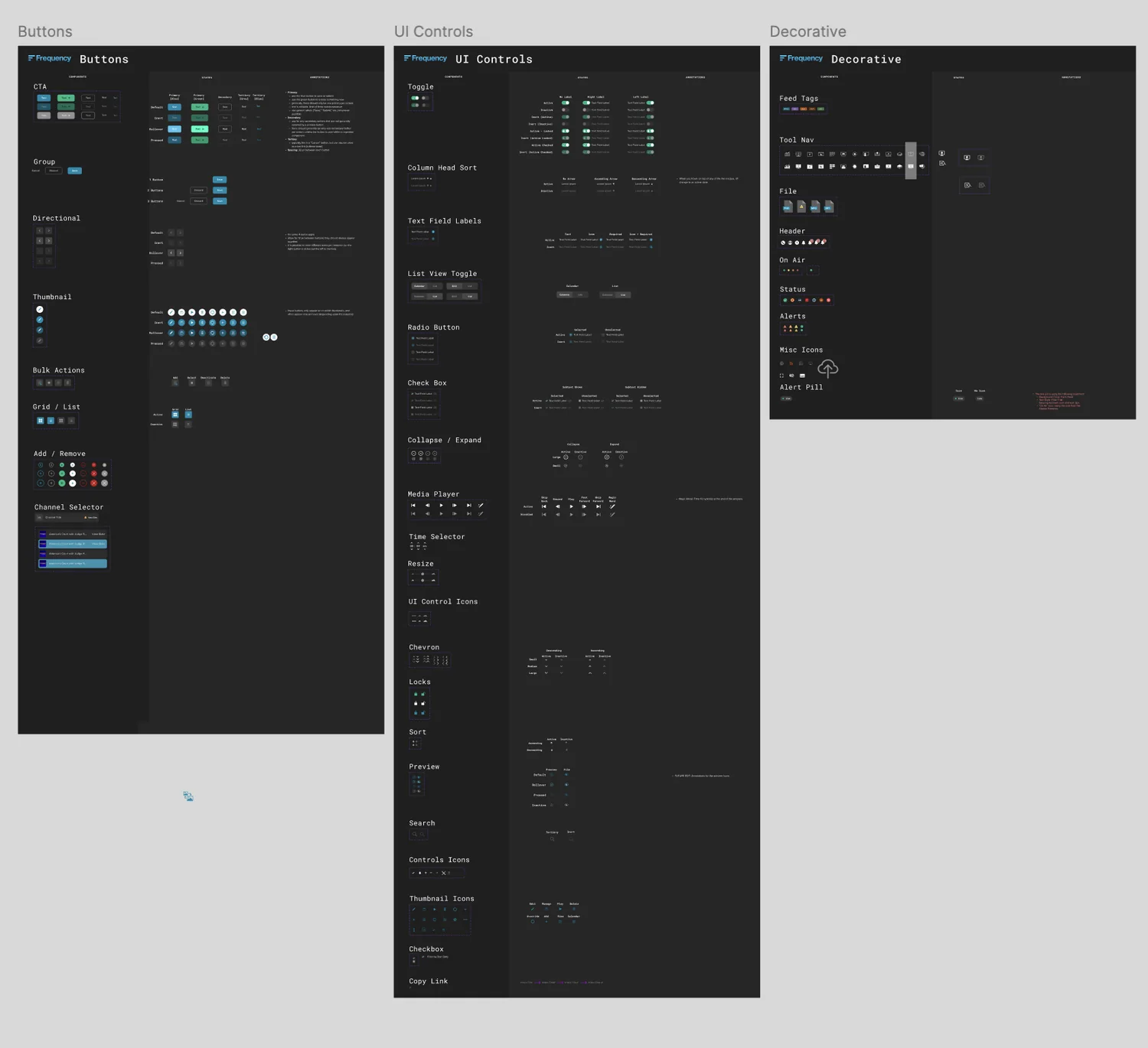
The costs were concrete. Engineers repeatedly asked why one table was styled one way and another differently. Those questions had no answer, because no decision had ever been made. Screens drifted apart because every designer made styling judgment calls in the moment.
The trigger was strategic: LLMs were getting good enough to produce believable mockups. But an LLM can only build from a system if the system is consistent and its rules are written down. So the goal became a pipeline: design system → tokens → AI-generated editable Figma designs → AI-generated front-end code. No one at the company, and as far as my research found few people anywhere, had walked this exact path. I read everything I could find and built the rest by trial.
02 Role and scope
- I owned: the token architecture, component rebuild, all 104 rule docs, the three audits, the harness itself, and the engineering roadmap and pitch. Built solo alongside my product work.
- Shared: my manager and a fellow designer are auditing the system's accuracy and rules before the next phase; contrast rulings are decisions the design team makes together; and I work with engineering to implement the changes.
03 Constraints
- No precedent. No playbook existed internally or externally to copy.
- A moving target. Best practices for LLM tooling changed monthly (skills, harnesses, MCP connections all appeared mid-project), so the approach had to keep absorbing capabilities that did not exist when I started.
- No engineering allocation. The design lane had to keep moving on its own, structured so nothing blocks on engineers until the last phase.
- A live product. Any eventual code change has to be provably safe, which shaped the roadmap's sequencing (aliased tokens first, visual regression before any cleanup).
04 Tokenization and components
Three-tier tokens, not two
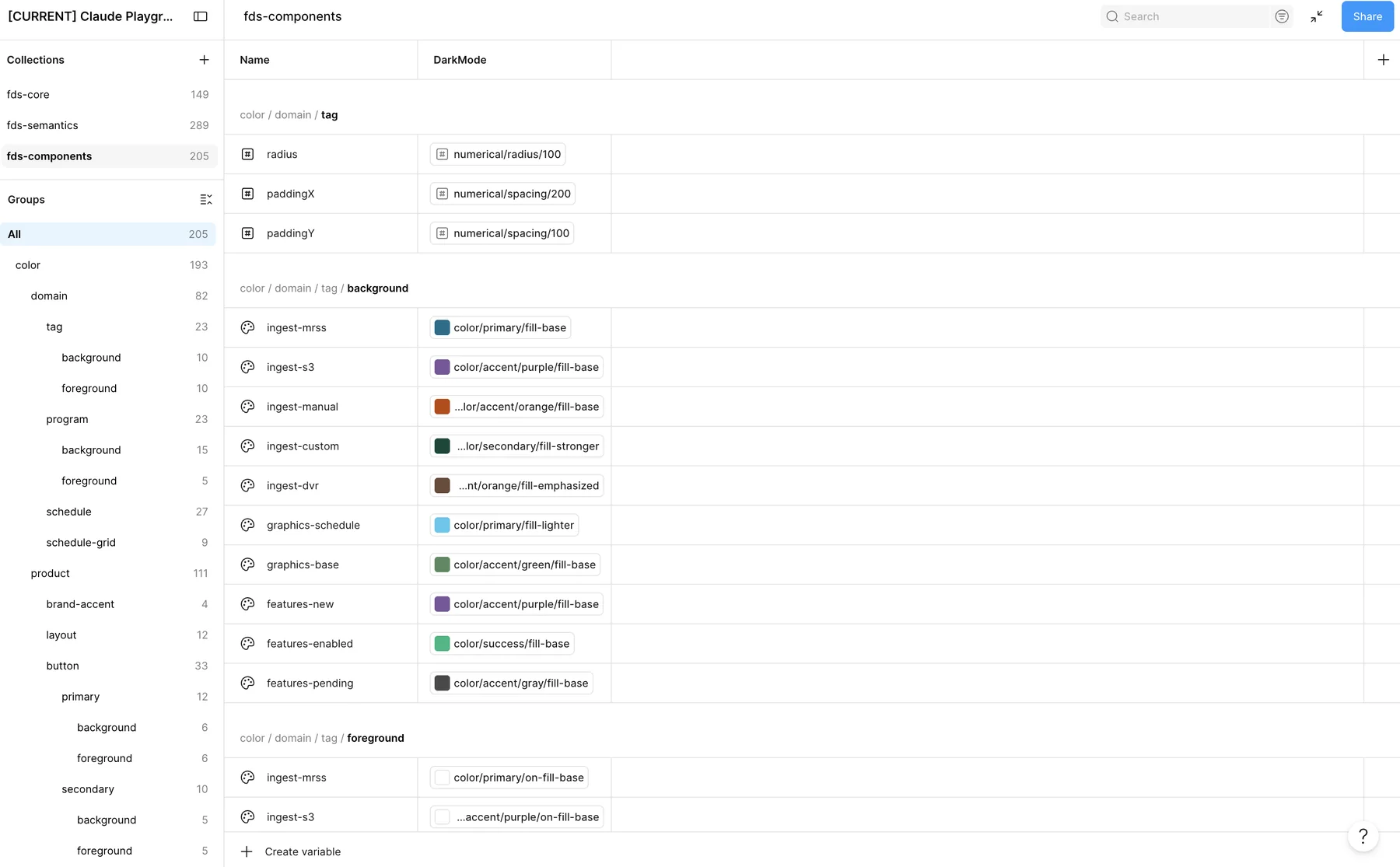
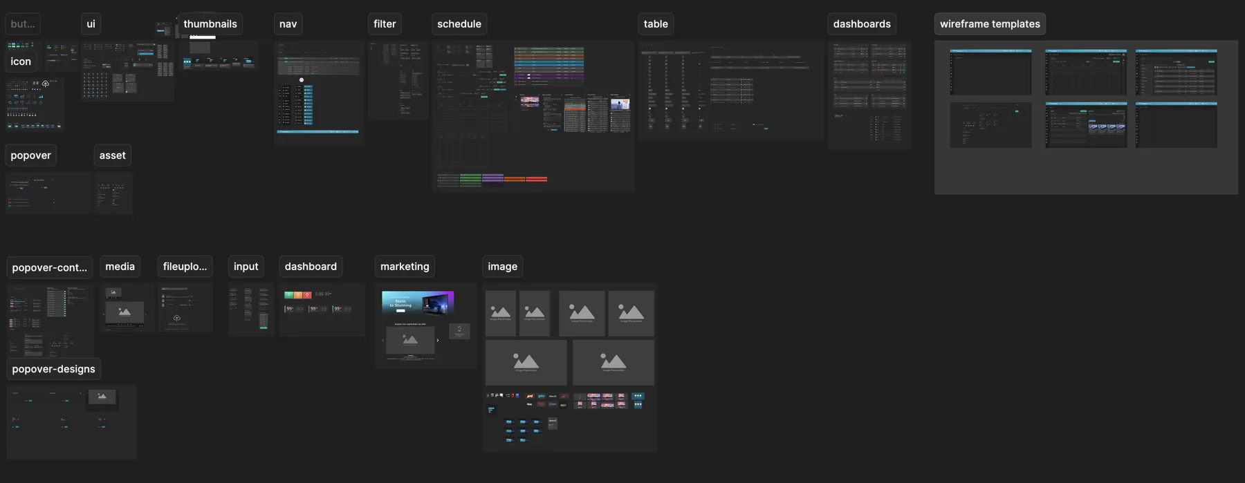
I structured tokens as primitives → semantic aliases → component tokens, 485 variables in total. Two tiers would have been faster to ship. But Studio keeps growing, and a two-tier system gets too broad as it does: semantic values end up shared across components that only look alike today, so changing one thing risks changing another. A third tier gives controlled separation. Each component draws from its own layer, so a new feature can be added, or one component retuned, without disturbing anything else. The trade-off was more modeling up front instead of unpicking a two-tier system later.
Writing the rules nobody had ever written down
Tokens give values, not rules.
The expectation was that tokenizing and mapping components would be enough. But tokens can't tell an LLM when to use a search box versus a search bar, or why Save is a Primary button while Create is Secondary. That judgment lived in designers' heads and had never been documented anywhere. So I authored per-component rule docs, 104 of them, covering what each component is for, its variants and states, and its dos and don'ts.
button-default.rules.md, one of the 104 rule docs. Every variant's role is a written decision, down to distinguishing "Inactive" (temporarily disabled) from "Inert" (permanently non-interactive):| Variant | Role |
|---|---|
| Primary | Save / Submit / Commit |
| Secondary | Create / Add (page-level) |
| Tertiary | Cancel / Edit / Duplicate |
| Quaternary | Lowest-weight action in a 3-button group |
A triage model for debugging a three-layer stack
When a generated screen came out wrong, the bug could hide in any of three places: a rule not yet captured in our design system, the LLM misreading an instruction or guessing into a gap, or the connector, a platform limitation in the MCP/API layer. Isolating the layer first saved days: fonts failing to render, for example, turned out to be an API bug, not a system gap.
05 The harness
I started from the wrong assumption. I thought a tokenized design system wired to our components would be enough for Figma's AI tools to generate accurate wireframes. Over the following months, as other LLMs improved and the Figma MCP connection matured, it became clear that betting on Figma AI alone was too narrow. The system needed to be built so any LLM could read it and compose screens, which meant a skill and a harness rather than a library.
There was no settled practice to copy. From January 2026 I worked through more than twenty articles on how people were building this, and the recommended approach kept moving. First it was a CLAUDE.md holding the rules. Then Google published design.md, and what belonged inside it differed by team. The definition itself is loose:a design harness is context, skills, orchestration and evaluations, and the right mix depends on the company.
So the work was sorting through what others were doing, deciding what our case actually needed, and testing it. A lot of back and forth, trial and error, and keeping current with a moving target. This is what we landed on:
skills/frequency-design-v1-jk/ loads on invoke
SKILL.mdentry pointreferences/load on demandvisual-patterns.mdcomponents.mdcomponent-keys.mdtokens-snapshot.jsonfallback only
docs/ the harness it points to
AGENTS.mdgovernance rules and QA gaterubrics/wireframe-token-compliance.mdoutput QAharness/fds-tokens.cssmaster tokens*.rules.md104 files, one per component*.tokens.css102 files, resolved valueslayouts/*.layout.md9 files, one per tool
The live Figma file stays the source of truth. Nothing loads all at once: a task reads the entry point plus only the slices it needs.
06 Path to code
For the system to eventually produce real code, I needed facts, not assumptions, about the gap between Figma and the codebase. I ran three audits (July 2026):
- ~2,270
- hardcoded color usages in the codebase, across 275 unique values
- 1,137
- color pairs contrast-tested in context, collapsing to 3 root decisions
- ~38
- shipped components the design system had never documented
The code audit also surfaced the useful part: 81 well-named CSS custom properties already in the stylesheet. A foothold to extend rather than a new pattern to introduce.
Those facts became the engineering pitch: Storybook → visual regression → an automated Figma-to-code token pipeline that ships as aliases of existing values (a day-one visual no-op) → Code Connect for the first ten components.
This is where the project stands today. I am auditing the current state of the codebase and building the roadmap I will take to our engineers, sequenced so that every step is provably safe: visual regression goes in before anything changes, and the first token release is a no-op by design. The goal is to make adopting tokens something engineering can say yes to without taking on the risk of breaking a live product.
07 Outcome
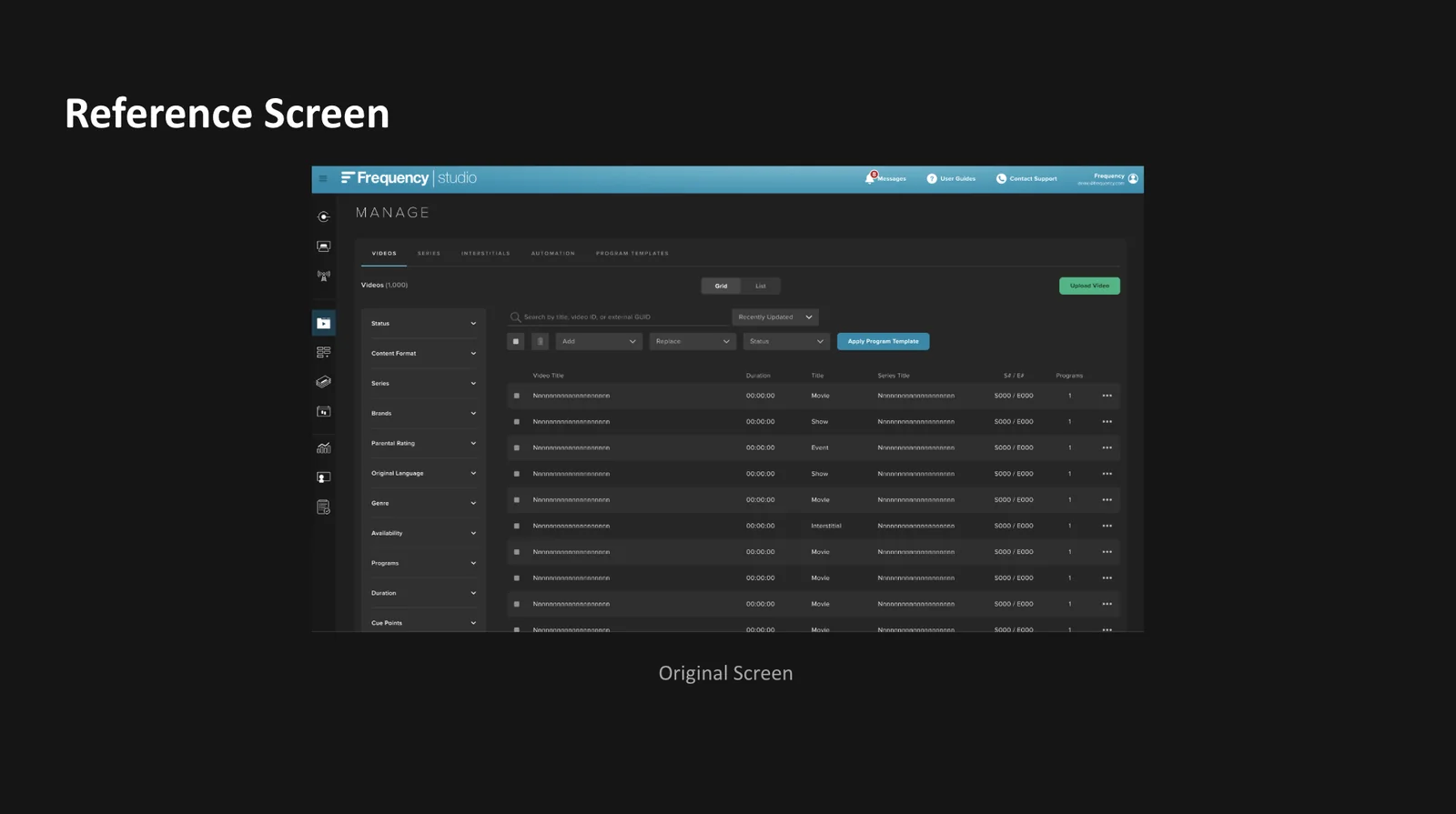
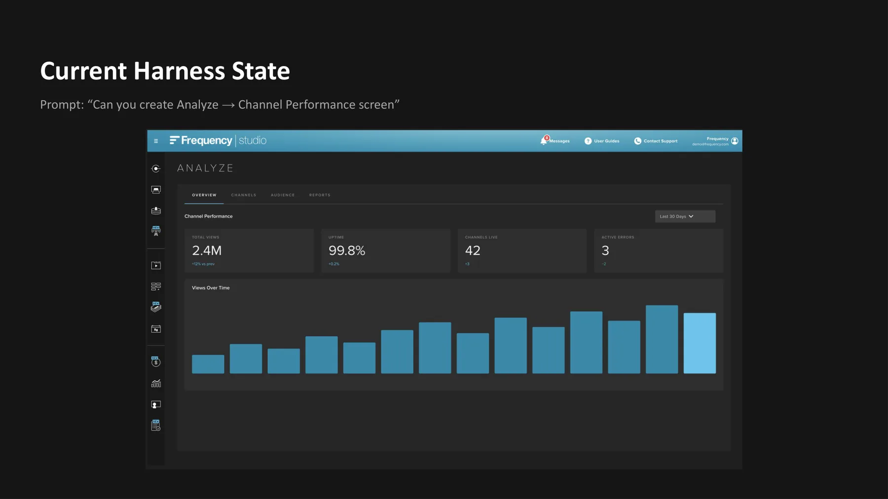
- The harness generates roughly 95% accurate recreations of existing Studio screens, and it follows the design guidelines well enough to produce new wireframes, features and components in the same style rather than only copying what already exists.
- Ideation and exploring new directions dropped from one to two days to about thirty minutes. That changes what exploration is worth doing: four directions in high fidelity is now a morning's work rather than a week's.
- It has already been used on multiple parts of the Monetize project, and the design team uses it for daily ideation and project kickoffs. Starting a new project conversation with a generated wireframe puts everyone on the same page before a single frame is drawn by hand.
- Leadership was impressed enough that people outside the design team have asked to use it.
Accuracy is my own assessment, from comparing generated output against production reference screens. Production adoption metrics begin with the engineering phase.
08 How I would measure this
The speed comparisons here are my own observed experience, not a study. What I would track as adoption widens:
- Token coverage in the codebase. Hardcoded color usages, currently around 2,270, should drop toward zero as Code Connect lands. That is a number engineering can already produce.
09 Reflection
- What I couldn't solve alone: the engineering lane. The design side is done enough to keep moving, but Storybook, the token pipeline, and Code Connect need an allocated engineer, and that resourcing conversation is the current frontier.
- What surprised me: the real output was not tokens, it was written-down judgment. The hardest things to produce were sentences like "Save is Primary, Create is Secondary, and here is why."
- What I'd improve next: the harness files are heavy; optimizing their weight, validating across environments (Claude and Figma Make), and completing the remaining component audits are the next design-side steps.